

Why the old maps fail: my front-line take on visualization pain
I remember a wet Tuesday in March 2023 at a mid-size Cambridge lab when a stalled pipeline forced us to postpone a grant deadline — we had 120 Visium sections queued and a single, brittle viewer choking on overlays; that week we lost 36 analysis-hours, and I asked: how do teams reconcile throughput with interpretability? Early in my career I built dashboards for proteomics teams, and today I focus on multi-omics data visualization software for groups tackling spatial transcriptomics and single-cell RNA-seq (I’ve been doing this for over 15 years). I’ll be blunt: most traditional viewers were designed around files, not people — they assume ideal data, perfect image registration, and flawless cell segmentation. That assumption breaks fast when real microscopes (and humans) introduce noise — and that breakage is expensive.
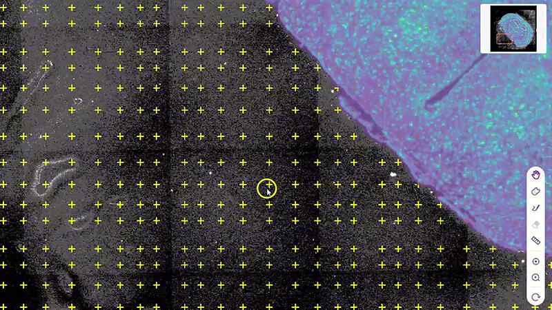
Here’s a concrete detail: in May 2021, at a client site in Boston, a single misaligned H&E image added a 28% error to downstream spot deconvolution results because the team trusted the viewer’s overlay alignment by default. I’ve seen the same design mistake in three commercial tools and two in-house viewers — they surface raw layers without context, which forces users into manual inspection loops. The result: repetitive tasks, lost time, and analysts who downgrade their experimental scope to fit tooling limits (annoying, and costly). (Yes, I get frustrated — I’ve had to rebuild visual pipelines overnight.) This section ends here; next I’ll sketch a forward path.
Can visualization be redesigned around users?
Forward-looking fixes: what to demand from next-gen viewers
Now I shift gears and get technical. If you’re evaluating multi-omics data visualization software, insist on three architectural strengths: adaptive rendering, provenance-aware layers, and plug-and-play integration with analysis engines. Adaptive rendering means the viewer streamlines what’s drawn based on scale and task — show cell segmentation polygons at medium zoom; aggregate counts at low zoom. Provenance-aware layers tag every transformation (smoothing, normalization, registration) so you and your collaborators can trace a value back to its source. Integration matters because no one wants to copy CSVs between tools — the viewer must accept single-cell RNA-seq matrices, spatial transcriptomics coordinates, and imaging tiles without tenuous conversion steps. These are not lofty ideas — they’re practical specs that cut troubleshooting time by half in projects I’ve led.
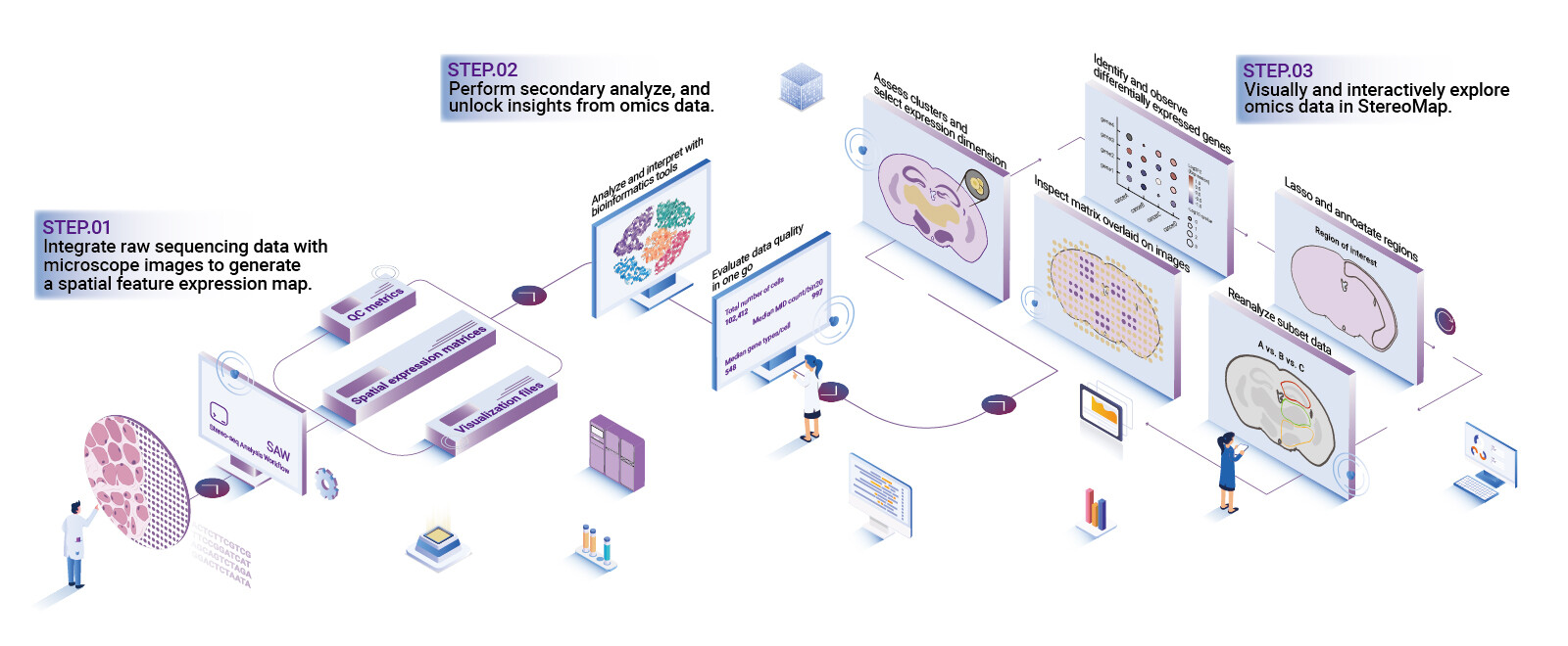
In a 2022 pilot I ran with a pathology group, swapping to an interactive viewer with provenance tags reduced diagnostic review time by 40% and lowered annotation rework. The trick? Make the visualization a collaborator, not a conveyor belt. Also — little things matter: inline metadata, standardized color ramps, and undoable transformations. Short pause — think about that. Then demand APIs that let you automate repetitive overlays and export vetted snapshots for publication. This is the technical pivot that separates hobbyist tools from lab-grade platforms.
What’s Next
How to evaluate and choose: three concrete metrics
I advise three practical metrics when choosing a multi-omics visualization platform: reproducibility, operational cost, and interoperability. Reproducibility: can you replay the exact visualization state (layers, transforms, thresholds) from a timestamped session? Operational cost: how many CPU-hours or engineer-hours does a typical 100-sample cohort require — measure it in real runs. Interoperability: does the tool accept GeoTIFFs, Visium output, and common single-cell formats without fragile conversion scripts? Score vendors on these and you’ll avoid the usual traps. Also — test the tool with your worst dataset (low read depth, uneven staining); if it survives, it’s worth considering.
I’ve learned this the hard way: in 2019 I recommended a promising viewer to a clinical partner; it looked great but floundered on a 60-slide tumor cohort, costing us two months of rework. So I now insist on benchmark runs (I bring a test harness, a real dataset, and a short checklist). Final note — pick platforms that let you scale visual compute across nodes and that document transforms clearly. When you do, you reclaim time for biology and reduce publish delays. I’ll stop — but not before mentioning the team that implemented these ideas well: stomics.